

Tame Your Sales Forecasts with the Amazing Banana Chart
If your enterprise software company is like most, at least 50% of your company’s bookings arrive in the last month of the quarter. For…

(Note: An updated version of this article — complete with a downloadable banana chart template — lives here: https://pmathieson.com/banana-chart/)
If your enterprise software company is like most, at least 50% of your bookings arrive in the last month of the quarter. For some companies (including a few in our portfolio) this number is closer to 60% or 70%. Not only is this a sub-optimal business practice — it can lead to fatigue, stress, high blood pressure, and executive insomnia.
It also makes forecasting almost impossible.
Why?
Because unlike, say, a retail business that uses the first week’s sales figures to estimate a reliable run rate for the quarter, your company’s first two months tell you very little about whether you can sufficiently hockey-stick in time to make the number. All you have to go on are pipeline figures (are you sure those deals are all real?) and the word of your lieutenants (and have they always followed through?).

And why is that a problem?
Well, the last thing you want to do is surprise your Board of Directors with an unexpected miss. As FloQast and Reach150 board member Rob Meinhardt says, “I’d rather have you tell me straight that you can’t hit your number than promise me the world and then not even come close.” One of the fastest ways to lose your Board’s confidence is by making poor forecasting a habit.
If the quota is out of reach, wouldn’t you rather deliver the message with a month to spare? What kind of information would you need to call a miss?
Enter the Amazing Banana Chart (hereafter referred to as merely “the banana chart”).
The banana chart is an extremely simple sales forecasting tool that answers a very simple question: Do I have a realistic shot of making the number this quarter? It’s called a banana chart because the shape of the curves look sort of like a banana (you’ll see in a second). This is what it looks like:
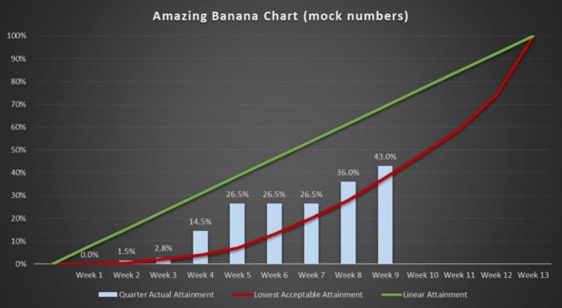
Let’s talk about the elements of the banana chart:
· The horizontal axis lists the 13 weeks of the quarter.
· The vertical axis tracks attainment of quota/plan over the duration of the quarter.
· The blue bars are actual aggregate bookings as they come in during the quarter.
· The green line is what the blue bars would line up against if your business brought exactly one-thirteenth of your quarterly quota each week (i.e. your company has no intra-quarter seasonality). If you’re a typical software business that books most business in the third month of the quarter, your blue bars will be well below the green line until weeks 12 or 13.
· The red line is the most important element of the banana chart. This line tells you the most back-loaded your company has ever been in each particular week of the quarter. Put another way, it’s the minimum weekly performance your company can put up to have a realistic shot at beating your quarterly number.
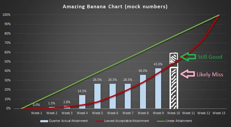
Using the banana chart is easy. Each week, you review your aggregate performance and see how it’s trending compared to the red line. If the blue bars remain above the red line, you’re all good. If the bars dip below, it means two things:
1. You’re probably going to miss your forecast this quarter.
2. You might pull off the miracle and come from behind to hit the number.
Forecasting the Miracle
This is key — if you’re going to forecast the come-from-behind miracle, you need to provide solid evidence that this is actually plausible. Maybe there’s a monster deal that’s almost definitely going to close by month’s end, or maybe your pipeline metrics are 3x higher than they’ve ever been. But you are not allowed to forecast 100%+ performance without substantiating why this quarter will buck the trend.
If you can’t come up with a truly solid reason for how you’ll pull this off, then you must call a miss.
Does this seem simple? It absolutely is.
But you’d be shocked at how many companies are incapable of accurate forecasting, despite having all the data necessary to make a prediction. Dedicating just three minutes a week to reviewing this chart is way more of a reality check than most early-stage companies ever perform.
The Bottom Line is: Use Your Data
Performing below your historical minimums is bad. Duh. But here’s the key: Don’t rationalize away the under-performance by counting on an unlikely miracle. Be honest about what your numbers are telling you, and make adjustments based on reality, not blind optimism.
In part II of this blog post series, we’ll describe exactly how you can build the Amazing Banana Chart, and provide you with some tools to help you make your own.